
The Southern New England American Planning Association (SNEAPA) conference takes place October 8–9, 2026, at Foxwoods Resort Casino in Mashantucket, Connecticut. The Social Explorer team will be there, and we look forward to connecting with planners, public officials, designers, engineers, students, and other attendees. Stop by to learn how Social Explorer can support your projects and workflows. You may also request subscription information or a demo any time.
Ahead of the conference, let’s explore Southern New England through data. SNEAPA brings together attendees from Connecticut, Massachusetts, and Rhode Island. Social Explorer’s mapping and reporting tools help us compare these states and examine the distinct communities within them.
Comparing the Three States
Social Explorer makes it easy to compare demographic characteristics using the American Community Survey (ACS). The 2020–2024 ACS five-year estimates put Massachusetts’s population at more than 7 million, roughly twice Connecticut’s 3.6 million and more than six times Rhode Island’s 1.1 million.
Social Explorer’s Studio helps users turn these data into tables and visualizations, including the following chart comparing race and ethnicity across the three states.
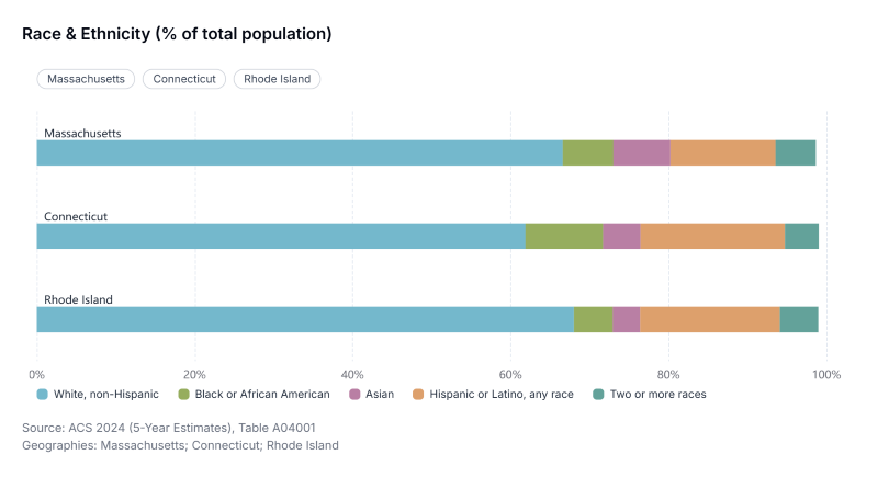
All three states have majority White populations. Massachusetts has the highest share of residents identifying as Asian alone (7.3%) and the largest number identifying as multiracial. Connecticut has the highest share identifying as Black or African American alone (10.6%), while Rhode Island has the highest share identifying as “Some Other Race” alone (7.8%). Hispanic or Latino origin is measured separately from race; Hispanic or Latino residents may identify as any race.
The following multi-variable map created with Social Explorer shows the racial and ethnic breakdown at the census tract level. Click around and zoom in to see neighborhood level detail.
Income, Purchasing Power and Inflation
Massachusetts has the highest median household income of the three states at $103,960, followed by Connecticut at $95,781 and Rhode Island at $87,796. All three exceed the national median of $80,734 in the 2020–2024 ACS five-year estimates.
Income figures tell a fuller story when we account for inflation and regional price differences. Social Explorer offers data for both types of analysis.
The Consumer Price Index (CPI), produced by the U.S. Bureau of Labor Statistics, measures changes over time in the prices urban consumers pay for a representative basket of goods and services. Social Explorer has CPI data from 1997 to 2026. Pairing CPI data with ACS income estimates helps distinguish nominal income growth from gains in purchasing power.
Comparing the ACS five-year releases ending in 2015 and 2024, Massachusetts’s median household income increased about 52% in nominal terms, from $68,563 to $103,960. Expressed in 2024 dollars, however, the earlier estimate is approximately $90,887, reducing the gain to about 14%.
Connecticut’s inflation-adjusted increase was smaller: from approximately $93,230 to $95,781 in 2024 dollars, a gain of about 2.7%. Rhode Island had the largest percentage increase of the three, rising about 16%, from approximately $75,363 to $87,796 in 2024 dollars. Its median household income nevertheless remained the lowest in the group.
These comparisons show why adjusting for inflation matters: increases in dollar amounts can substantially overstate gains in purchasing power.
Regional Price Parities (RPPs), produced by the U.S. Bureau of Economic Analysis, measure differences in price levels across states and metropolitan areas relative to the national average. While CPI helps compare incomes over time, RPPs help compare what those incomes can buy in different places. Social Explorer has RPP data from 2009 to 2024 available in the data library.
Using the selected RPP values to adjust household incomes to the national price level brings Massachusetts’s median from $103,960 to approximately $98,301. Connecticut’s adjusted figure is approximately $92,444, compared with its nominal median of $95,781. Both adjustments reflect prices above the national average.
Rhode Island’s price level is about 2.3% above the national average in this comparison, giving it the smallest adjustment of the three. Its adjusted income is therefore closest to its nominal value.
For planners, these comparisons provide context for examining affordability and household resources across communities.
Examining Commuting Delays
Social Explorer’s transportation data resources help users examine how people travel and the burdens they face along the way. For example, the Texas A&M Transportation Institute’s Urban Mobility Report (UMR) tracks traffic congestion across 494 U.S. urban areas. Its measures include travel delay, excess fuel consumption, congestion costs, and the Travel Time Index. Social Explorer provides historical UMR data from 1982 to 2024 (with rankings available from 2014 onward) for comparing congestion across places and over time.
The following table shows annual hours of delay per auto commuter for selected urban areas in Southern New England.
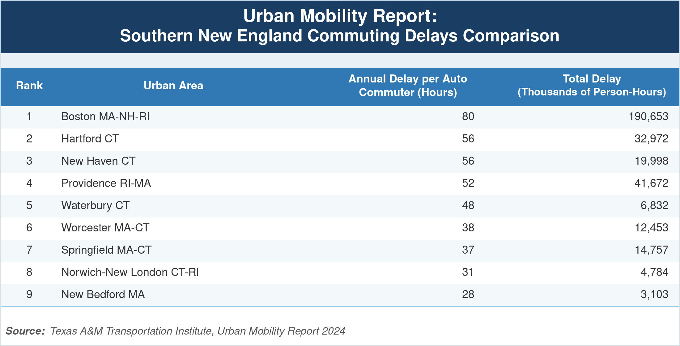
Boston, MA–NH–RI, has the highest delay among the areas shown: 80 hours per commuter in 2024, ranking 12th nationally on this measure. The other selected areas range from 28 to 56 hours, with Hartford and New Haven each recording 56 hours.
Several urban areas cross state lines. Boston includes parts of New Hampshire and Rhode Island; Providence includes parts of Massachusetts; and Worcester and Springfield include parts of Connecticut. State groupings in the table reflect each area’s primary anchor state rather than boundaries confined to a single state.
For additional perspectives on transportation, check out Social Explorer's other transportation-related datasets, including the American Community Survey, the Longitudinal Employer-Household Dynamics, the Fatality Analysis Reporting System, the National Transit Database, and more.
Exploring Environmental Burdens
Social Explorer’s environmental datasets add another dimension to regional and neighborhood analysis.
The EPA’s EJSCREEN tool combined environmental and demographic indicators to help identify communities facing disproportionate environmental burdens. After the EPA removed the tool from public access, Social Explorer developed a replacement EJSCREEN tool using publicly available data and the EPA’s published methodology.
The following map shows census tract detail for lead paint exposure risk, one of the twelve environmental indicators in Social Explorer’s EJSCREEN dataset.
In the state-level comparison, Connecticut, Massachusetts, and Rhode Island each rank at or above the 86th national percentile on the Lead Paint EJ Index, with Rhode Island at the 94th percentile. This reflects the region's dense stock of pre-1940 housing, which is strongly associated with lead paint hazard.
The underlying lead paint indicator uses the share of occupied housing units built before 1960 as a proxy for potential exposure. The EJ Index combines that indicator with demographic factors to highlight communities most impacted. (These scores help identify places for further investigation; they do not measure actual lead exposure or confirm lead hazards in individual homes.) Zoom into the map to explore differences across neighborhoods.
For more environmental data analysis opportunities, visit Social Explorer’s data library to try out the FEMA's National Risk Index, EPA’s Air Quality Index, Census Community Resilience Estimates, NOAA Climate Normals, and additional specialized datasets.
Expand Your Analysis with Social Explorer
From state comparisons to neighborhood maps, Social Explorer helps planners explore the conditions shaping their communities. Our data library covers demographics, transportation, environmental burdens, housing, crime, and more.
Start with Social Explorer’s maps and reports to explore Southern New England and beyond. If you’re attending SNEAPA, connect with our team to discuss your work. New to the platform? Learn about subscriptions or request a demo.