
In part one of Social Explorer’s analysis of the youngest Americans, we examined where families with young children live and how those patterns have changed. For part two of our series, we’re focusing on housing safety and affordability. Social Explorer offers a variety of resources and tools to identify rent-burdened families and also neighborhoods with a high risk of lead paint exposure. For this analysis, we’ll use the American Community Survey (ACS), the Comprehensive Housing Affordability Strategy (CHAS), and the Environmental Justice Screening and Mapping Tool (EJSCREEN).
Building on data from ACS estimates, the U.S. Department of Housing and Urban Development's (HUD) CHAS data is the go-to source for affordable housing planning, grant applications, and fair housing analysis. Social Explorer's library includes CHAS data from 2009 through the latest release (based on HUD’s calculations of 2022 ACS data).
CHAS data helps researchers quickly identify areas at high risk for lead paint exposure and areas with significant housing cost burdens, all the way down to the census tract level. For example, the following map shows where young children in older housing with extremely low household incomes are concentrated. Explore the map to view renter-households earning 0 to 30% of the HUD Area Median Family Income (HAMFI) in pre-1940 housing with children age 6 or younger.
HAMFI is a special median family income value calculated by HUD to show local cost burdens (rather than using a single national median, it relies on small area adjustments). Pre-1940 housing has the highest risk of containing deteriorating lead-based paint. (Lead-based paint was banned for residential use in 1978, so data on pre-1980 housing stock could also be useful for this type of analysis..)
The ranked list of counties with populations of 100,000 or more underscores how the Northeast/Rust Belt corridor's dense pre-WWII housing stock shapes the nation's lead exposure risk.
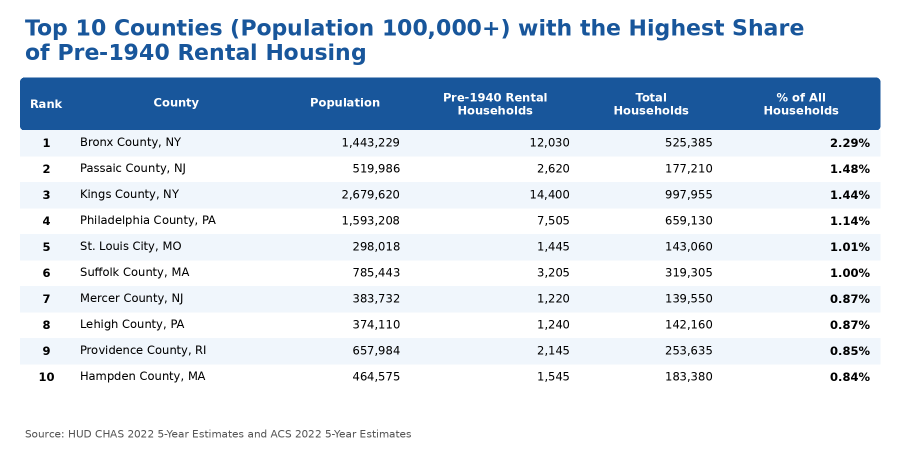
New York City leads with the Bronx (#1) and Kings County (Brooklyn) (#3) at the top, reflecting the city's large stock of pre-war apartment buildings and tenements. New Jersey, Pennsylvania, Massachusetts, and Ohio also have notable areas of high risk.
A deeper look at the map and data allows for further examination of counties with smaller populations. The data also reveal smaller counties with relatively high percentages of households with young children at potential lead exposure risk, such as Stanly County, NC (population 62,723, and 1.35% of households) and Washington County, NC (population 11,051, and 2.86% of households) in the South. The following map highlights North Carolina at the census-tract level to enable a close-up view of neighborhoods.
Enhance your research and incorporate the latest available data with the ACS (2024 five-year estimates). Social Explorer subscribers can access ACS data to examine the 11.4 million households with children living in poverty across the country, of which 29% include at least one child under five years old. For example, comparing data across multiple ACS survey years from 2009 to 2024 with just a few clicks, researchers can identify where child poverty has grown the most. The ACS five-year estimates reveal that Loudoun County, VA, experienced the largest growth of households with children under five in poverty (131% increase), followed by Rockland County, NY (89.5% increase).
The EPA’s EJSCREEN tool helps identify communities that may face higher environmental burdens and health risks due to pollution and socioeconomic factors. After the EPA discontinued its environmental justice tool, Social Explorer created an updated version of EJSCREEN to fill the gap for researchers. Learn more about our methodology and coverage here. Built with the EPA's framework plus updated data, Social Explorer's EJSCREEN offers another way to highlight lead paint risk to young children. This measure uses the percentage of housing units built before 1960 as one indicator of lead exposure risk, along with socioeconomic factors such as income and race.
The following EJSCREEN map of the New York City area highlights neighborhoods with a 90% or higher index on lead paint exposure risk. The examination at the block group level allows for the most detailed level of analysis available.
Social Explorer: The Home for All Your Demographic Research
Further your research into generations, housing, burdens, and more with Social Explorer. This analysis navigated between just three of the many datasets available in our data library.
Social Explorer’s data and tools can help shape policy solutions and outreach strategies as well. For instance, further analysis of household types (family structure) or language spoken at home could help fine-tune where to target programming to address lead paint exposure risk or child poverty, and how to support related communication efforts.
Let Social Explorer’s tools enrich your planning, grant writing, advocacy, and other research. Sign up for a free Social Explorer account to try it out today.