Using the interactive legend
The map legend in Social Explorer maps is now a separate component located in the bottom-left corner of your screen. You can switch between different legend modes: minimized, maximized, detailed, and simplified. Your annotations, additional map layers, and filtering criteria will also be displayed in the map legend.
Highlight data ranges on the map
Since the colors displayed on a map rarely have an inherent meaning, reading a map can be quite a challenge. This is why we’ve made the map legend interactive.
Click on a data color in the legend to highlight the areas on the map which fall within that particular data range. This way you can quickly focus on the states with the highest income or lowest population density without getting distracted by other groupings on the map.
Style the visualization
Social Explorer provides a set of predefined color palettes to allow for better data visualization. Here's how to choose a color palette from the map legend:
- Click the Style the visualization icon
in the map legend.
- Select Change color palette.
- Choose the color palette that works best with your dataset.
Once you select a color palette, it becomes the "preferred" color palette, and the application tries to honor your choice until you select a variable that specifies a different color palette. You may also create your own custom color palette. Click here for instructions.
Show satellite view
You can switch to satellite view right from the map legend. Enabling satellite view displays the present day satellite imagery of the area you are viewing in Social Explorer. Toggle Satellite view on in the map legend to display satellite view.
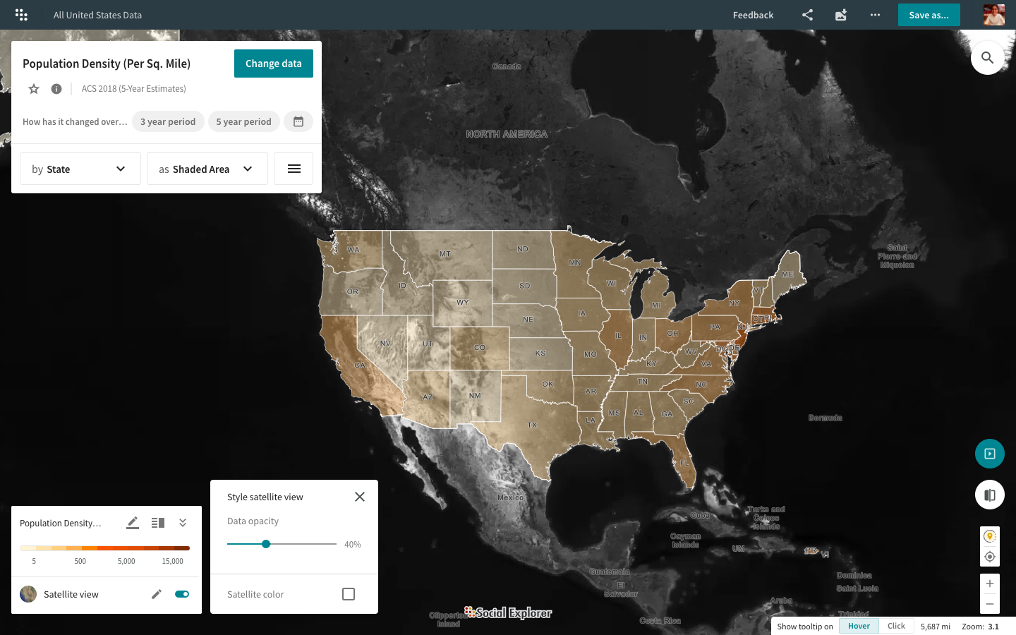
Once you have enabled satellite view, click on the edit option to tweak the opacity of the data layer and switch between a black and white satellite imagery and a color option.