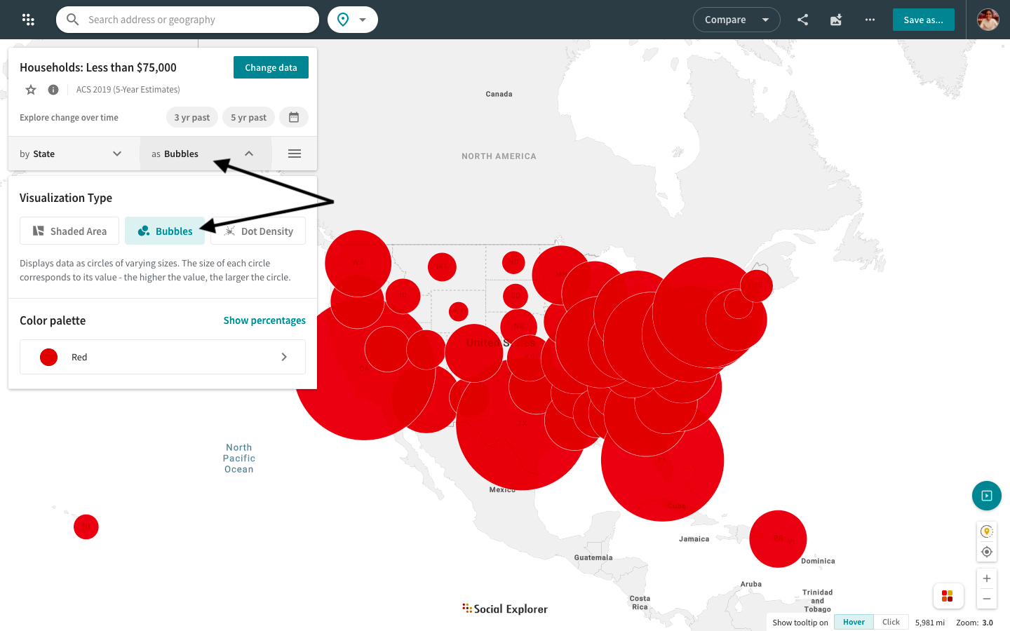
Change data visualization type
Social Explorer can display data as a shaded area, a dot density, or a bubble map. Shaded area or choropleth maps are used to display percentages, medians, rates, averages, or other area normalized measures. Bubble and dot density maps are used to display raw counts, like population or housing counts. You may also add percentages to a bubble map (click here for instructions).
- In the Change data menu, click Change visualization type.
- Select the visualization type that works best with your dataset.

If you've selected a bubble map to visualize your data, you now have the option to automatically adjust the bubble sizes according to the data values for a clearer visual representation. Simply click on Auto Adjust in the map legend to do so.
Head over to this guide to learn more about data visualization types.