Show percents on Bubble maps
Bubble maps have the ability to display multiple pieces of information in a single visualization. The size of the bubble shows the value, and you can add a color gradient to show the related percentage.
- Click on Change visualization type.
- Select Show percentages.
- To customize the color palette used for the bubbles, click on Change color palette.
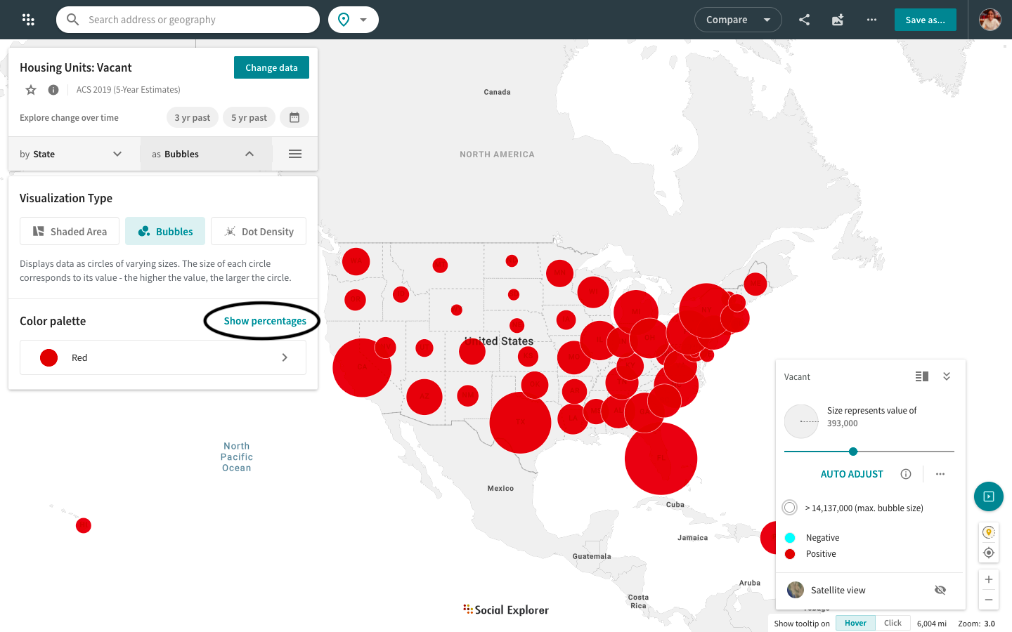
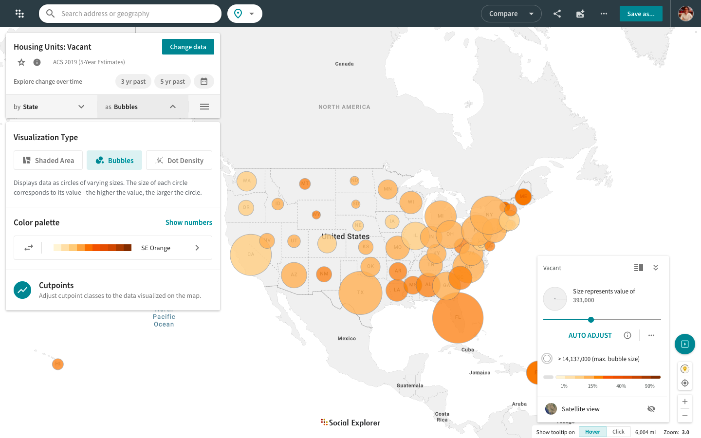
Social Explorer supports shaded bubble maps only for certain variables. For example, when visualizing Total Population: White Alone, the size of the bubble will indicate the number of the white population and all the bubbles will be the same color. However, if you select 'Show percentages', the values will be calculated into percentages and each group of percentages will be represented by a different shade of the color. While you can tweak the span of each group, groups are divided into increments of 5%.
The map legend is now a separate component located in the bottom right corner of your screen. You can switch between different legend modes: minimized, maximized, detailed, and simplified. You can also edit cutpoints and switch to satellite view or auto adjust your shaded area and bubble maps directly from the map legend.