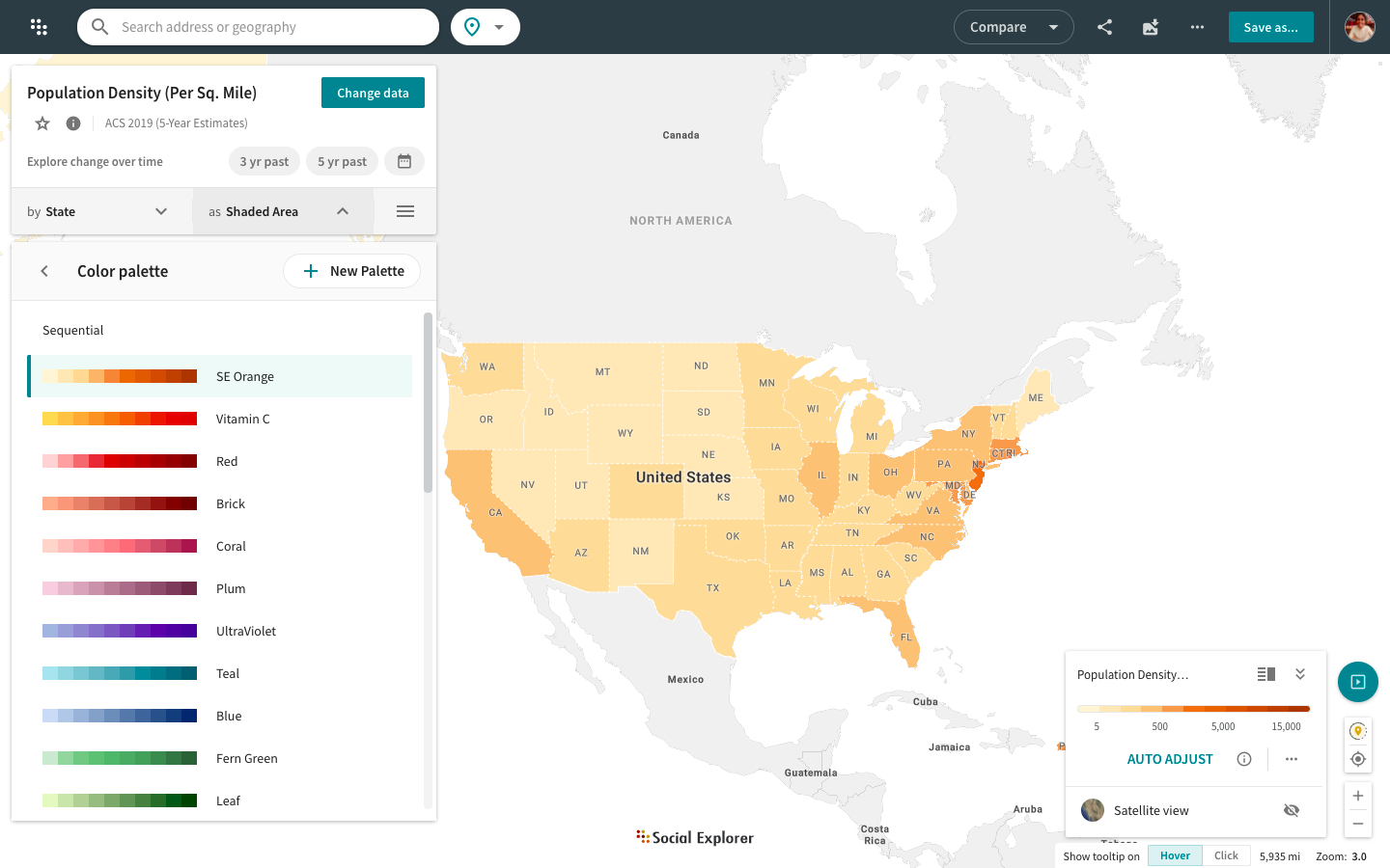
Choose a color palette
Social Explorer provides a set of predefined color palettes to allow for better data visualization. There are two ways to choose a color palette.
From the Change data menu
- Click Change visualization type in the Change data menu.
- Select Change color palette.
- Choose the color palette that works best with your dataset.
Once you select a color palette, it becomes the "preferred" color palette, and the application tries to honor your choice until you select a variable that specifies a different color palette.
You may also create your own custom color palette. Click here for instructions.
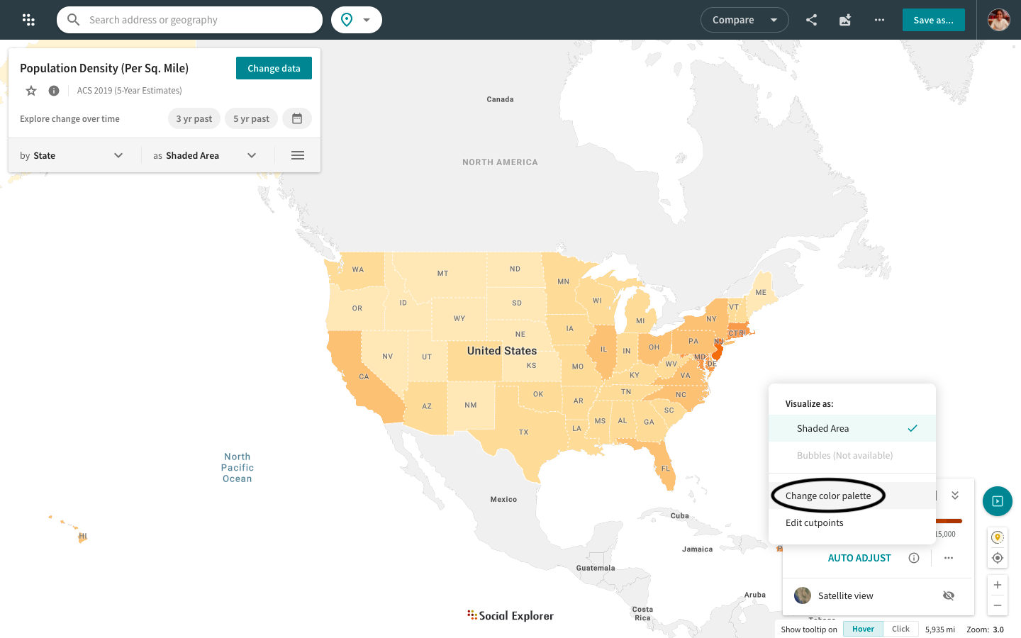
From the map legend
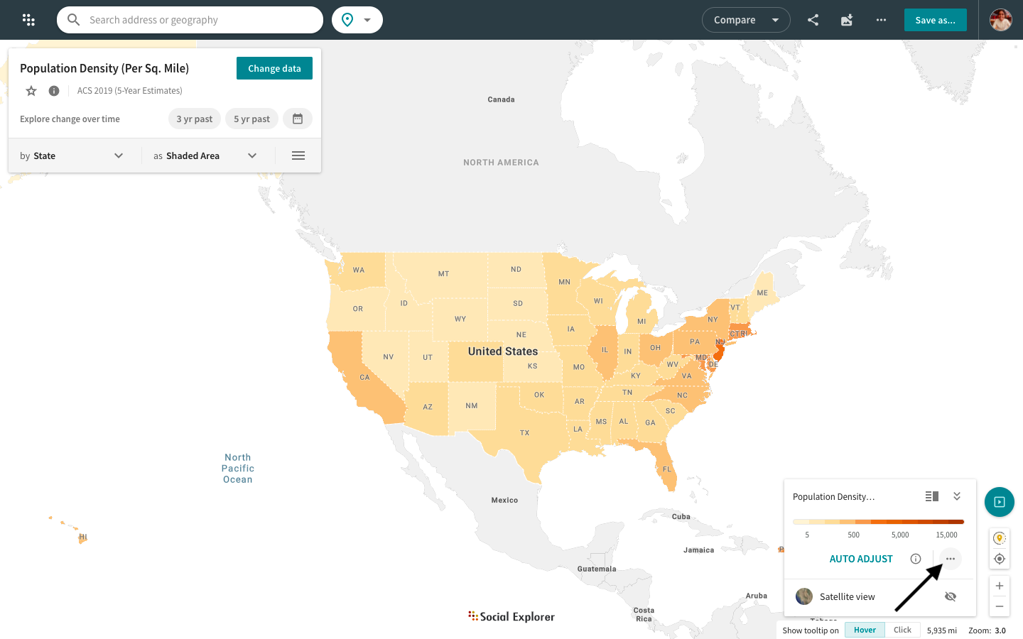
- Click the
icon in the map legend in the bottom right corner of your map.
- Select Change color palette from the popup.
- Choose the color palette that works best with your dataset.
Explore brand new additions to the color palette for Social Explorer maps. Choose from exciting new color palettes, like Sunset and Oasis for the sequential scheme or Choco Mint and more for the diverging scheme to visualize your research.
The map legend is now a separate component located in the bottom right corner of your screen. You can switch between different legend modes: minimized, maximized, detailed, and simplified. You can also switch to satellite view or auto adjust your shaded area and bubble maps directly from the map legend.